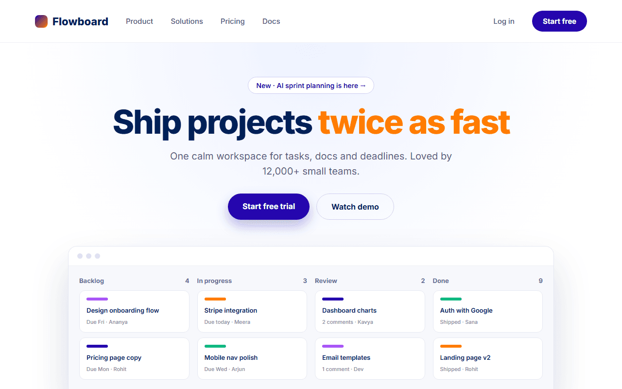
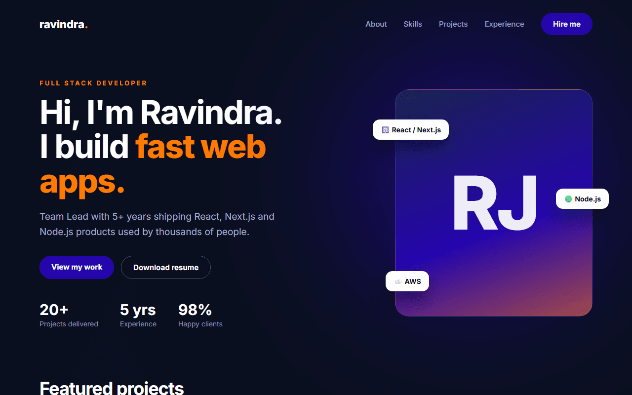
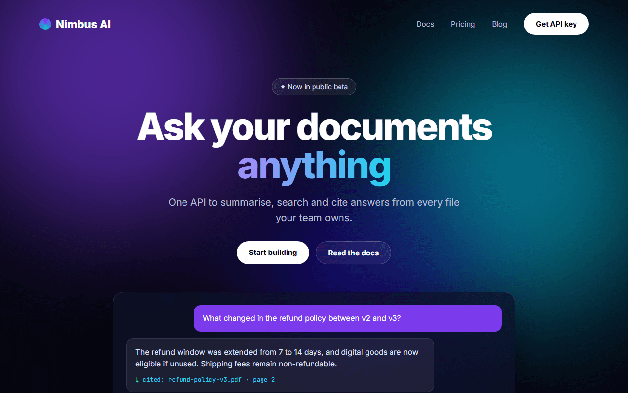
Creative Agency Website
A bold, editorial website for a design or development agency, built around oversized typography and a large case-study grid.
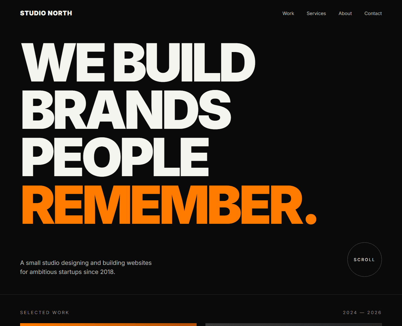
Example of the website this prompt builds. Your result will use your own name, text and images.
- Tech stack
- Next.js (App Router) + Tailwind CSS
- Colour palette
#0a0a0a#f5f5f0#ff7b00#3b3b3b
- What it builds
- Minimal navbar
- Oversized type hero
- Selected work grid
- Services list
- Process
- Team
- Client logos
- Contact CTA
- Footer
The prompt
Copy everything in the box. Text in quotes and the sample business details are meant to be replaced with your own.
Build a website home page for a small creative agency called "Studio North" that designs and builds websites for startups.

Tech stack: Next.js (App Router) with Tailwind CSS.

Visual style: bold and editorial. Near-black background (#0a0a0a), off-white text (#f5f5f0), one accent colour orange (#ff7b00). Very large headline type (up to 12vw on desktop) with tight letter-spacing, thin dividing lines, lots of empty space. Images have no rounded corners. Minimal UI chrome.

Sections, in order:
1. Minimal navbar: wordmark left, "Work, Services, About, Contact" right. On mobile, a full-screen overlay menu with large links.
2. Hero: an oversized two-line statement ("We build brands people remember."), a short paragraph and a round "Scroll" indicator.
3. Selected work: a 2-column grid of 6 case studies. Each is a large image placeholder with the client name, project type and year underneath. On hover the image scales slightly and an arrow appears.
4. Services: a numbered list (01-04) of services, each row showing the service name in large type and a short description that expands on hover or tap.
5. Process: four steps in a horizontal row (Discover, Design, Build, Launch) with a thin connecting line.
6. Team: four team members with square photos, names and roles.
7. Clients: a row of 8 client names in muted text.
8. Contact CTA: a huge "Let's talk" link with the email address below.
9. Footer: address, social links, copyright.

Interactions: text lines slide up into view on scroll; links have an underline that draws in from the left; a custom cursor is NOT needed.

Quality bar:
- Fully responsive: design mobile-first, then tablet (768px) and desktop (1200px).
- Accessible: semantic HTML landmarks, one h1, alt text on images, visible keyboard focus, colour contrast of at least 4.5:1 for body text.
- Fast: no heavy libraries, lazy-load images below the fold, system or two web fonts at most.
- Use placeholder images from a neutral source and realistic sample copy (no lorem ipsum).
- Respect prefers-reduced-motion for every animation.
- Keep the code clean and commented so I can edit it by hand.
How to use this prompt
- 1
Open an AI coding tool. Use any capable assistant: Claude, ChatGPT, Cursor, v0, Bolt, Gemini. Tools that can create files (Cursor, Claude Code, v0, Bolt) are the most convenient because they write the project for you.
- 2
Replace the sample details. Copy the prompt and change the business name, location, colours and any section you do not need. The more specific your details, the better the result.
- 3
Paste the prompt and generate. Send the whole prompt in one message. If the reply is cut off, say “continue from where you stopped”, or ask for one section at a time.
- 4
Run it on your computer. Create a project with “npx create-next-app@latest”, add the generated files, then run “npm run dev” and open http://localhost:3000.
- 5
Review and refine. Check it on a phone-width screen, fix anything that looks off by describing it in plain words, then use the follow-up prompts below to add features one at a time.
- 6
Replace placeholders and publish. Swap in your real text and images, then deploy. Vercel and Netlify both host this kind of site for free.
Follow-up prompts
Send these one at a time after the first version is working. Small, specific requests give much better results than one giant prompt.
Add a /work/[slug] case-study page with a full-width hero image, project facts, long-form content and a 'next project' link.
Add page transitions between the home page and case studies.
Create a contact form page with budget and timeline select fields.
Tips for a better result
- This style depends on strong imagery. Swap the placeholders for real project screenshots early.
- Oversized type must still wrap well on phones; ask the tool to check 360px width.
- Want to hand-build a section instead? The Templates library has heroes, pricing tables, FAQs and more with full code.